
Why Metrics Define Community Success
Communities are no longer just a “nice-to-have” feature of modern organizations. They are engines that drive product adoption, reduce support costs, and build brand loyalty. Yet measuring the true health of a community remains one of the biggest challenges for leaders.
Too often, teams fall back on vanity metrics such as likes, shares, or raw follower counts. These numbers can look impressive on a dashboard, but they fail to answer a more critical question: is the community creating meaningful connections that deliver business outcomes?
For community leaders, the path forward requires moving beyond surface-level numbers. By focusing on the analytics that capture participation, retention, sentiment, and advocacy, organizations can prove ROI and optimize strategies with confidence.
This guide outlines the community engagement metrics that matter most, why they are essential, and how to track them effectively using a structured reporting framework.
The Shift From Vanity Metrics to Meaningful Engagement
The early era of online communities measured success by size: the bigger the membership, the healthier the group was assumed to be. But as any experienced community manager knows, a large but silent group offers little value.
Vanity metrics include:
- Follower counts
- Total members joined
- Page views or likes
These can be tracked easily but fail to capture depth. A forum with 10,000 registered users but only 50 active contributors is not a thriving community. By contrast, a space with 1,000 members where 300 post, attend events, and share solutions regularly is far more valuable.
The modern definition of engagement: sustained, meaningful interaction between members that drives adoption, learning, or advocacy.
Organizations that adopt this mindset report higher retention, faster adoption of new features, and stronger customer trust. In fact, research shows brands with active online communities see a 53 percent increase in customer retention compared to those without.
What Engagement Really Means
Engagement is about quality, not quantity. It captures whether members are not only consuming content but also creating, sharing, and collaborating.
Signals of meaningful engagement
- Members supporting peers through answers, tutorials, or resources
- High rates of returning members across weeks or months
- Frequent user-generated content, such as posts, event recaps, or success stories
- Member-driven referrals and advocacy campaigns
These signals show that a community is more than a collection of users. It is a network where knowledge flows, trust builds, and members become champions of the brand.
Matching Business Goals With the Right KPIs
Every community exists to serve a purpose. Some focus on customer support, others on product adoption, and many on building long-term loyalty. The first step in designing an analytics framework is to clarify your community’s primary objectives and align them with the right KPIs.
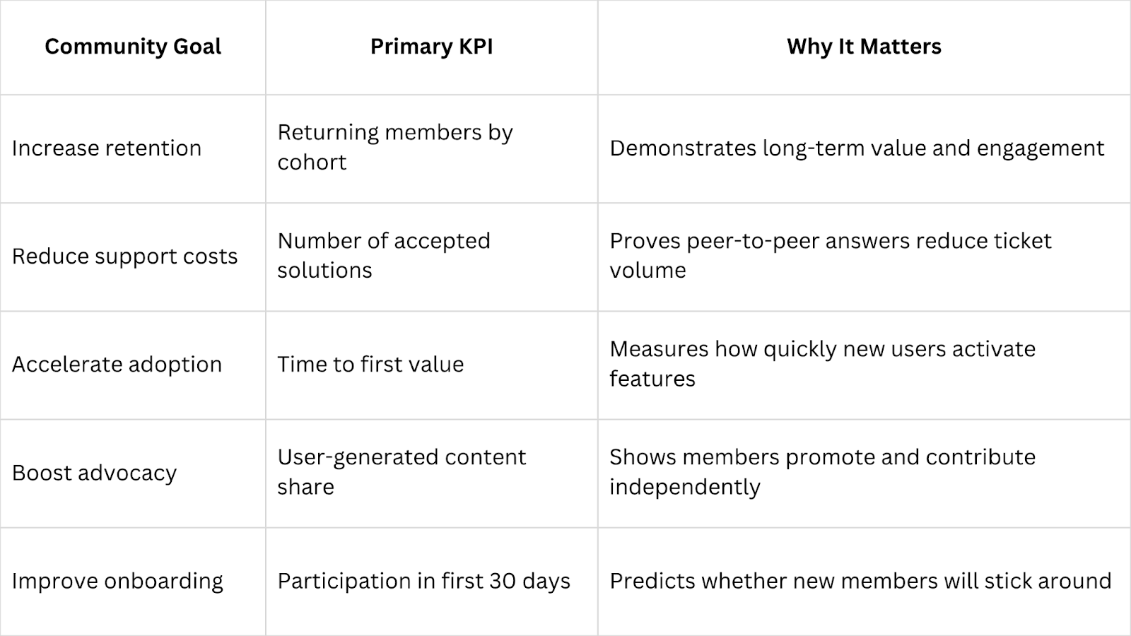
This table serves as a roadmap. It ensures your reports highlight the metrics that actually move the needle rather than numbers that look good but lack business impact.
Core Metrics That Matter
Active Members (DAU, WAU, MAU)
Tracking daily, weekly, and monthly active users reveals whether your community is growing or losing momentum. Unlike vanity numbers, active members indicate real participation. A steady increase shows relevance, while a decline signals disengagement or unmet needs.
User-Generated Content (UGC %)
Formula:
UGC posts ÷ (UGC + host posts) × 100
Communities thrive when members create content on their own. A high UGC percentage means your members feel empowered to contribute, not just consume. Low UGC suggests overreliance on moderators or staff to drive discussions.
Accepted Solutions
In communities that support products or services, accepted solutions are gold. They show members are solving each other’s problems, reducing pressure on support teams. Tracking solution rates also highlights champions who consistently contribute high-value answers.
Returning Member Rate
Engagement is not a one-time event. Measuring how many members return within set timeframes (weekly, monthly) is one of the strongest predictors of community health. Communities with high return rates foster loyalty and deeper connections.
Sentiment Analysis
Numbers only tell part of the story. Sentiment analysis adds context by measuring tone, feedback, and overall attitudes. Positive sentiment reflects trust and satisfaction, while negative sentiment highlights risks that require fast responses.
Net Promoter Score (NPS)
NPS is widely used across industries to measure customer loyalty. Within a community, it asks: “How likely are you to recommend this community to others?” High scores demonstrate advocacy and serve as a leading indicator of long-term growth.
Event Participation
Events are cornerstones of many communities. Tracking attendance, engagement during sessions, and replay views reveals whether programming meets member needs. High participation suggests strong alignment with interests; declining numbers may point to scheduling or topic gaps.
Building a Reporting Cadence
Even the best metrics are meaningless without a clear reporting process. Communities need a rhythm that balances fast feedback with long-term trend analysis.
Weekly pulse checks
- New members joined
- Posts created and replies given
- Accepted solutions and flagged content
- Event attendance snapshots
Monthly deep dives
- Active member rates and cohort analysis
- User-generated content share
- Sentiment insights with sample quotes
- Impact on support ticket deflection
Quarterly business reviews
- Retention improvements linked to community participation
- Product adoption tied to feedback loops
- Advocacy campaigns driven by user-generated content
- Expansion opportunities within member segments
This cadence ensures leaders see immediate issues, managers track growth, and executives receive clear evidence of ROI.
From Data to Action
Collecting numbers is only step one. The value comes from turning metrics into action.
Scenario 1: Retention is dropping
Action: Improve onboarding. Host a “new member mixer” or create a guided path to value within 30 days.
Scenario 2: Solutions are low
Action: Empower power users. Launch a champions program that recognizes and rewards helpful contributors.
Scenario 3: UGC is stagnant
Action: Spark contributions. Post weekly prompts, run contests, or highlight top member posts in newsletters.
Scenario 4: Negative sentiment is rising
Action: Address concerns directly. Open feedback threads, acknowledge pain points, and show members how their input drives change.
Each action closes the loop between what the data reveals and how the community evolves.
Designing Dashboards Leaders Trust
Dashboards should not overwhelm with every possible metric. They should answer one question: “Is our community healthy?”
Six essential dashboard elements
- Active members segmented by cohorts
- Time to first value for new users
- Accepted solutions vs. support tickets
- Event participation and repeat attendance
- UGC percentage trends
- NPS movement over time
Pair charts with narrative insights. A dashboard is not just a spreadsheet — it is a story that highlights impact, risks, and next steps.
Examples of Metrics in Action
- Atlassian uses product groups within its community to host Q&A sessions with engineers. Accepted solutions deflect support tickets and provide clear proof of ROI.
- Salesforce Trailblazer Community tracks event participation and MVP advocacy. Their analytics show a direct correlation between certifications and community-driven training sessions.
- HubSpot Ideas Forum ties product feedback to roadmap updates. By tracking feature requests and votes, HubSpot proves the community directly influences innovation.
Each example demonstrates how metrics go beyond numbers and guide real business decisions.
Why Bevy Is Built for This
Measuring engagement requires more than spreadsheets or disconnected tools. Bevy centralizes community activity, event data, and analytics in one platform.
- Events and groups: track participation across global chapters or niche cohorts
- Discussions: measure replies, solutions, and peer-to-peer engagement
- Dashboards: visualize metrics that align with business goals, from retention to adoption
- Integrations: connect insights to CRMs, marketing platforms, and product analytics tools
With Bevy, community leaders can move from anecdotal reporting to precise, data-driven storytelling that resonates with executives.
Conclusion
Community engagement analytics must move beyond vanity metrics if organizations want to prove value and scale. Active participation, retention, UGC, sentiment, and event engagement reveal whether members are truly invested; and whether communities are delivering ROI.
By aligning KPIs with business goals, setting a clear reporting cadence, and acting on insights, leaders can transform communities into growth engines. With Bevy, all the critical data points come together in one place, empowering you to measure what matters and scale what works.