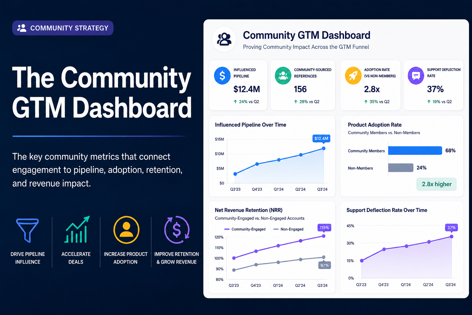
The Community GTM Dashboard: Metrics That Prove Impact to Your CMO
The key metrics that measure community GTM impact are: influenced pipeline (total pipeline value from opportunities where a community touchpoint occurred), community-sourced references, product adoption rate among community members versus non-members, support deflection rate, net revenue retention among community-engaged accounts, and community content contribution to organic search traffic. Together, these metrics connect community engagement to the revenue and efficiency outcomes that executive leadership tracks. Building a dashboard around these metrics is what transforms a community program from an engagement initiative into a credible, funded business function.
If you are a community leader who has been asked to justify community investment to your CMO, CFO, or revenue leadership, this framework gives you the measurement structure to do it.
Introduction
The conversation has a familiar arc. You present your community metrics at a quarterly review: monthly active members up 18%, event attendance strong, forum engagement trending in the right direction. You feel good about the numbers. Then someone at the table, usually the CMO or the CFO, asks a straightforward question: "What does any of this mean for the business?"
It is not a hostile question. It is a reasonable one. Executive leadership is responsible for allocating budget and headcount toward activities that produce business outcomes. If community cannot speak that language, it will always be treated as a cost center rather than a growth lever.
The challenge is not that community does not produce business outcomes. The research is clear that it does. IDC's analysis of 200 enterprise B2B technology companies found that organizations with structured community programs experienced 25% lower support costs, 18% higher product adoption rates, and 12% higher net promoter scores compared to companies without structured programs. OpenView Partners' Product Benchmarks data shows that B2B SaaS companies with active customer communities grow net revenue retention 5 to 10 percentage points faster than companies without communities. These are real business outcomes. The problem is that most community programs do not have the measurement infrastructure to connect their specific activity to these kinds of results.
This article provides a practical framework for building the Community GTM Dashboard: the measurement system that connects your community engagement data to the pipeline, adoption, retention, and efficiency metrics your CMO needs to see. It draws on MIT Sloan Management Review's four-layer community measurement framework and translates it into the specific metrics, data sources, and reporting structure that enterprise community leaders can build and present with confidence.
Why Most Community Programs Stall at Surface Metrics
Before building a better measurement framework, it helps to understand why so many community programs are stuck reporting metrics that do not move executive decision-making.
MIT Sloan Management Review's research on measuring community business impact identifies a clear pattern. Most community programs operate at what the researchers call layer one and layer two: activity metrics and engagement quality metrics. Activity metrics count things. Posts, replies, members, events attended, questions asked. Engagement quality metrics measure the depth of those activities: answer rates, content quality scores, repeat participation, session ratings. These metrics are useful for managing the community day to day. They tell you whether the community is healthy and whether members are finding value. But they do not tell leadership what the community is worth to the business.
The financial impact measurement that executive audiences require happens at layers three and four: outcome metrics (support deflection, product adoption correlation, retention correlation) and financial impact metrics (influenced pipeline, expansion revenue contribution, cost per resolution). Getting from layer one to layer four requires something most community programs do not have: data infrastructure that connects community engagement activity to the CRM, product analytics, and customer success systems where business outcomes are recorded.
The research brief finding from IDC reinforces this precisely. The most impactful community programs combine forums, events, and knowledge management in a single platform because fragmented tools create data silos that prevent the kind of cross-system attribution that layer three and four measurement requires. If your community lives in four separate tools with no unified engagement record and no CRM integration, you cannot build a GTM dashboard. You can only report what each tool shows in isolation, and none of those isolated views tells the business story that earns community a seat at the revenue table.
This is the infrastructure gap that the measurement conversation must address directly. Building the right dashboard starts with making sure the platform and integration foundation can support it.
The Community GTM Dashboard: Four Metric Categories
The Community GTM Dashboard organizes metrics into four categories aligned to the four primary GTM outcomes a community program can deliver: pipeline influence, deal acceleration, product adoption, and retention and revenue expansion. Each category speaks to a different executive stakeholder and maps to a different set of data sources.
Pipeline Influence - CMO, VP Marketing - Influenced pipeline value, community-sourced MQLs, organic traffic from community content, content contribution to search visibility
Deal Acceleration - VP Sales, CRO - Champion references provided, win rate on deals with champion touch points, sales cycle length comparison
Product Adoption - VP Product, VP Customer Success - Feature adoption rate among community members vs. non-members, time-to-value comparison, self-service resolution rate
Retention and Revenue Expansion - CFO, CRO, VP Customer Success - NRR among community-engaged accounts vs. non-engaged, churn rate comparison, expansion revenue attribution, support cost per resolution
Pipeline influence
Pipeline influence metrics answer the question that CMOs and VPs of Marketing ask most often about community: is this driving pipeline, and how much?
Influenced Pipeline Value
Influenced pipeline is the total dollar value of sales opportunities where at least one stakeholder in the buying process had a meaningful community touchpoint during the sales cycle. A community touchpoint includes attending a community event, reading community forum content, engaging with a community-sourced content asset, interacting with a community champion, or registering for a community webinar.
Measuring influenced pipeline requires two components working together. First, your community platform must capture engagement activity at the member level with identifiers that can be matched to CRM records. Second, your CRM must have a mechanism for logging community touch points against opportunity records, either through direct integration or through a manual process supported by the community and marketing operations teams.
According to a 2025 survey of 500+ B2B community and marketing professionals by Common Room, 68% of organizations with mature community programs report that community directly influences pipeline, with a median self-reported influence of 15% to 25% of total pipeline value. These figures are self-reported from community leaders and marketing teams, not independently audited. Your organization's number will reflect your program's maturity, the quality of your CRM integration, and how rigorously community touch points are captured. The value of establishing this metric is not to claim a specific percentage in your first reporting period. The value is to establish a baseline that grows more meaningful as your tracking infrastructure matures.
Community-Sourced MQLs
Community-sourced MQLs are leads who met both fit and intent criteria after a community touchpoint served as the initial or primary awareness trigger. A prospective buyer who found your community through organic search, engaged with forum content over several weeks, and then registered for a community event before completing a demo request form is a community-sourced MQL. Tracking this metric requires clear source attribution in your marketing automation system and agreement with the demand generation team on how community touch points are defined and logged.
This metric is particularly useful for CMOs because it translates community influence into the marketing funnel language they already use to evaluate channel performance.
Organic Traffic from Community Content
Community forums, knowledge articles, and event content generate organic search traffic from prospective buyers who are researching solutions during their independent research phase. Tracking the volume of organic sessions originating from community platform pages, the keywords driving those sessions, and the downstream behavior of those visitors (event registrations, content downloads, demo requests) quantifies the demand generation contribution of community content.
Forrester research consistently finds that B2B buyers complete the majority of their purchase research independently before engaging a vendor, and that peer input ranks among the top three most trusted information sources during that research phase. The organic traffic your community generates is reaching buyers at exactly this stage. Reporting this traffic alongside its conversion behavior makes community's demand generation contribution tangible and comparable to other marketing channels.
For the detailed framework on how community content drives organic pipeline, see our guide on how community content drives demand generation.
Deal Acceleration Metrics
Deal acceleration metrics answer the question that sales leaders ask: is community shortening our sales cycles and improving our win rates?
Champion References Provided
The baseline metric for a community champion program is the number of reference conversations champions participated in during a given period. This is the activity layer of champion program measurement. It tells you whether the program is producing the advocacy output that sales depends on, but it does not yet tell you whether those references are working.
Track this by logging reference requests and completions in the CRM or in the champion program management system within your community platform. Over time, you should be able to see which champions are most active, which sales segments are using the reference program most frequently, and whether the supply of available references is keeping pace with sales team demand.
Win Rate on Deals with Champion Touch Points
Compare the win rate on opportunities where a community champion reference, event appearance, or peer interaction occurred against the win rate on comparable opportunities without a champion touchpoint. This comparison is the most direct evidence of whether champion program investment is producing sales impact.
In enterprise B2B, where buying committees require peer validation and independent confirmation before committing to a significant investment, the win rate difference between deals with and without champion involvement tends to be meaningful. Wharton School research on word-of-mouth in buyer decisions documents that referrals and peer recommendations close at multiples of the rate of cold outbound leads. Measuring and reporting your organization's specific win rate differential puts a number on this dynamic that your CRO and VP Sales will take seriously.
For the full playbook on champion program design, recruitment, and management, see our guide on community champion programs that accelerate sales.
Sales Cycle Length Comparison
Track the average number of days from opportunity creation to close for deals that included a champion touchpoint versus deals that did not. If champion involvement shortens the sales cycle by even a few weeks across a meaningful volume of opportunities, the revenue velocity impact at the portfolio level is significant. A 10-day reduction in average sales cycle length for 50 enterprise opportunities per year is a concrete, calculable number that belongs in a CMO or CRO presentation.
Product Adoption Metrics
Product adoption metrics answer the question that VP Product and VP Customer Success teams care most about: are community members getting more value from the product, and are they getting it faster?
Feature Adoption Rate: Community Members vs. Non-Members
Compare the rate at which community-engaged customers adopt key product features to the rate among customers who are not community participants. This comparison requires connecting community membership data to product analytics, which means having a community platform that exports member identifiers in a format your product analytics tool can ingest.
IDC's analysis of enterprise community programs found that companies with structured community programs experienced 18% higher product adoption rates. The mechanism is peer learning. When customers share how they use product features to solve specific business problems, those use cases become visible to other customers who can then adopt similar approaches in their own workflows. Community members who are exposed to peer use cases and best practices adopt features at higher rates because they understand the value of those features in practical terms, not just as items in a feature matrix.
Time-to-Value Comparison
Time-to-value (TTV) is the duration between a customer's initial purchase and their first meaningful outcome with the product. Community membership and activity during the onboarding phase can shorten TTV by connecting new customers to peer knowledge, onboarding resources, and experienced community members who can answer specific implementation questions.
Measure TTV separately for customers who join the community within their first 90 days versus customers who do not. If community-engaged new customers reach their first meaningful product outcome faster, this metric strengthens the business case for integrating community into the customer onboarding program. For customer success teams, a shorter TTV is directly correlated with lower early-stage churn, which feeds into the retention metrics in the next category.
Self-Service Resolution Rate
Track the percentage of common product questions resolved through community self-service (forum searches, AI knowledge search, peer answers) without requiring a support ticket. The self-service resolution rate is a shared metric between the product adoption story and the efficiency story. High self-service resolution means customers are finding answers in the community and continuing to use the product productively, which supports adoption. It also means fewer support tickets, which reduces support cost, which appears in the efficiency section of the dashboard.
AI knowledge search across community content directly improves this metric by surfacing relevant answers from the community's accumulated knowledge base in response to member queries, reducing the need for members to ask questions that have already been answered.
Retention and Revenue Expansion Metrics
Retention metrics answer the questions that CFOs and CROs ask when evaluating community as a revenue protection and growth investment: are community-engaged customers sticking around longer, and are they spending more?
NRR Among Community-Engaged Accounts vs. Non-Engaged Accounts
Net revenue retention (NRR) measures the percentage of revenue retained from existing customers including expansions, upsells, and contractions. Comparing NRR for community-engaged accounts against accounts with no meaningful community participation is the most direct financial measure of community's retention impact.
OpenView Partners' Product Benchmarks data shows that B2B SaaS companies with active customer communities grow NRR 5 to 10 percentage points faster than companies without communities, based on self-reported survey data from participating companies. At an organizational level, a 5-percentage-point NRR improvement across a significant customer base represents substantial retained and expanded revenue. The ability to present your organization's specific NRR differential between community-engaged and non-engaged accounts in a board meeting or a budget review is the most compelling single argument for community investment that executive audiences consistently respond to.
Calculating this metric requires tagging customer accounts in your CRM or customer success platform with community engagement status and comparing renewal and expansion rates across the two populations over a 12-month period. The longer the observation period, the more meaningful the comparison becomes.
Churn Rate Comparison
Track the churn rate among community-engaged accounts versus non-engaged accounts. If community-engaged customers churn at a meaningfully lower rate, this metric has a direct revenue implication that finance and customer success leadership can translate into dollar terms.
Community reduces churn through several mechanisms. It increases switching costs by creating social connections and knowledge investments that make leaving the vendor more costly. It surfaces early signals of dissatisfaction through community sentiment and engagement changes, giving customer success teams earlier visibility into at-risk accounts. The Pulse Sentiment Agent in Bevy's Engagement Hub is designed to surface exactly these signals, giving community and customer success teams actionable early warning before a renewal conversation becomes difficult.
For a clear presentation to the CFO, calculate the revenue value of the churn rate difference. If community-engaged accounts churn at a rate 5 percentage points lower than non-engaged accounts, and your average contract value is $50,000, and you have 200 community-engaged accounts, the annual revenue preservation from that churn differential is calculable and significant.
Support Cost Per Resolution
Support deflection is often the most immediately quantifiable financial benefit of a community program because the cost inputs are concrete. A Forrester Consulting Total Economic Impact study examining enterprise technology companies found that community Q&A forums deflected 20% to 35% of incoming support tickets, with average savings of $8 to $15 per deflected ticket. Over three years, the composite organization in the study realized between $1.2 million and $3.5 million in support cost savings from community-based deflection. Attribution note: Per the Phase 1 Accuracy Review, the commissioning company for this Forrester Consulting study requires human verification to confirm it is not an excluded competitor before specific figures are cited in the final published version of this post.
To calculate your organization's support deflection savings, start with the average cost of a support ticket in your organization (typically in the range of $10 to $50 for enterprise SaaS companies depending on the complexity of the issue and the cost of your support team). Multiply that cost by the number of community questions that received a peer answer without generating a corresponding support ticket. This calculation produces a defensible, conservative estimate of support cost savings that your CFO will recognize as sound financial reasoning.
IDC's analysis corroborates the scale of this impact, finding that companies with structured community programs experienced 25% lower support costs overall. Presenting a specific deflection calculation alongside this benchmark gives your CMO and CFO both a data-backed industry reference and your organization's specific number.
Building the Dashboard: Data Sources and Integration Requirements
The Community GTM Dashboard is only as good as the data that feeds it. The following data sources are required to produce each metric category.
Community platform data: Member engagement activity (posts, replies, event registrations, event attendance, content contributions, AI knowledge search queries), member identifiers that can be matched to CRM records, champion program activity tracking.
CRM data: Opportunity records with community touch points logged, opportunity stage and close date, deal value, win/loss outcomes, account health and renewal status.
Web and marketing analytics: Organic sessions originating from community platform pages, keyword rankings for community content, conversion events from community-referred visitors.
Product analytics: Feature adoption rates by customer cohort, time-to-first-value by customer cohort, active usage metrics.
Support system data: Ticket volume, ticket categories, cost per ticket, self-service deflection rate.
Customer success platform data: NRR by account cohort, churn rate by account cohort, expansion revenue by account cohort, health scores.
The integration architecture that makes this dashboard possible requires a community platform with CRM integration and data export capabilities. MIT Sloan Management Review's research identifies the lack of this integration as the primary barrier that prevents most community programs from reaching layer three and four measurement. A unified community platform that combines forums, events, and engagement data in one system is the infrastructure prerequisite. Without it, each data source remains in a separate system, and the connections between community activity and business outcomes remain invisible to the people who need to see them.
For the full picture of how community programs generate the GTM outcomes this dashboard measures, see our guide on the four GTM outcomes community programs deliver.
Presenting Community GTM Metrics to Executive Leadership
Building the dashboard is the technical step. Presenting it effectively to your CMO, CFO, or CRO is the communication step. A few principles make the difference between a presentation that earns investment and one that gets politely acknowledged and filed away.
Lead with outcomes, not activities. Open with influenced pipeline value, NRR differential, and support cost savings. Save active member counts and engagement rate charts for the appendix. Executives who manage revenue and budget make decisions in the language of dollars, percentages, and time. Start there.
Show comparisons. Metrics without context are hard to evaluate. Community members versus non-members. Deals with champion touch points versus deals without. Community-engaged accounts versus non-engaged accounts. Every meaningful community metric becomes more compelling when compared against a relevant baseline.
Be honest about data maturity. If your CRM integration is new and your influenced pipeline attribution is six months old rather than two years, say so. Executives respect transparency about measurement limitations more than they trust numbers that look too clean. Present a maturity roadmap alongside the current dashboard so leadership can see the measurement getting sharper over time, not just the results.
Connect community investment to cost per outcome. Instead of asking for budget in the abstract, present community investment as a cost-per-outcome calculation. What does influenced pipeline cost to generate through the community channel compared to paid demand generation? What is the cost per support ticket resolution through community versus through the traditional support channel? Framing community as a cost-efficient GTM channel, rather than a standalone investment, positions it within the financial logic your CFO already uses to evaluate marketing and customer success spending.
Frequently Asked Questions
What metrics measure community impact on go-to-market results? The key metrics that measure community GTM impact are influenced pipeline value, community-sourced MQLs, feature adoption rate among community members versus non-members, self-service resolution rate, net revenue retention among community-engaged accounts compared to non-engaged accounts, support cost per resolution, champion references provided, and win rate on deals with champion touch points. Together, these metrics connect community engagement to the pipeline, adoption, retention, and efficiency outcomes that CMOs, CFOs, and revenue leaders track.
How do you connect community engagement data to pipeline? Connecting community engagement data to pipeline requires a community platform that captures member engagement activity at the individual level and produces identifiers that can be matched to CRM contact and account records. When a community member attends an event, reads forum content, or interacts with a champion, that activity needs to be logged against the corresponding CRM record as a touchpoint. Over time, aggregating these touch points across opportunities allows the community team to calculate influenced pipeline value and report community's contribution to the sales funnel.
What is community influenced pipeline? Community influenced pipeline is the total dollar value of sales opportunities where at least one stakeholder in the buying process engaged with the company's community during the sales cycle. This engagement can include attending a community event, reading community forum content, interacting with a community champion, or engaging with community-sourced content. It is measured by connecting community engagement data to opportunity records in the CRM through platform integration or manual logging, and it represents the portion of total pipeline where community activity played a role in shaping the buyer's evaluation.
How do you prove community ROI to a CMO or CFO? To prove community ROI to a CMO or CFO, present community data in the financial language they already use. Show influenced pipeline as a dollar value. Calculate support deflection savings by multiplying resolved community questions by the average cost of a support ticket. Compare NRR for community-engaged accounts against non-engaged accounts and translate the difference into retained revenue. Frame community investment as a cost-per-outcome calculation and compare it to the cost per outcome of other GTM channels. Lead with comparisons and business outcomes, not activity metrics. Executives who manage revenue and budget make decisions in the language of dollars, percentages, and time.
What should a community GTM dashboard include? A community GTM dashboard should include four categories of metrics: pipeline metrics (influenced pipeline value, community-sourced MQLs, organic traffic from community content), deal acceleration metrics (champion references provided, win rate on deals with champion touch points, sales cycle length comparison), product adoption metrics (feature adoption rate among community members versus non-members, time-to-value comparison, self-service resolution rate), and retention metrics (NRR among community-engaged accounts versus non-engaged, churn rate comparison, support cost per resolution). The dashboard pulls data from the community platform, CRM, product analytics, support system, and customer success platform to provide a unified view of community's business impact.
How do community members compare to non-members on retention and adoption? Research consistently shows that community members retain at higher rates and adopt product features more broadly than non-members, though the specific magnitude varies by organization and program maturity. OpenView Partners' Product Benchmarks survey data shows B2B SaaS companies with active communities grow NRR 5 to 10 percentage points faster than those without. Common Room's survey of 500+ B2B community and marketing professionals found that community members retain at 1.4 times the rate of non-members on a self-reported basis. IDC's analysis of 200 enterprise technology companies found 18% higher product adoption rates among organizations with structured community programs. These are benchmark figures. Your organization's specific comparison should be measured directly by connecting community membership data to product analytics and CRM renewal data.
See How Bevy Connects Community Data to Business Outcomes
The Community GTM Dashboard requires a platform that unifies your community engagement data, integrates with your CRM and business systems, and gives your team the reporting infrastructure to prove community's impact to the people who make budget decisions.
See how Bevy brings forums, events, user groups, and analytics together in one unified platform built for enterprise community teams - Learn More.